Automated marketing and site development.
Ahem, Excuse Me
Ahem, Excuse Me
As marketers, one of the biggest challenges we face is growing our marketing list at a rate higher than our attrition. On average, companies report an attrition rate of about 20%, which means in order to show a growth of just 10% per year, we need an actual growth of 30%. That’s a lot of growth and yet many of us simply have not developed a concrete plan to achieve this goal
In the age of shiny, new objects, we have at our disposal tools, widgets, scripts, and doo-dads all designed to entice, encourage, beg, and withhold in order to garner the most valuable of data: our prospects’ email address. I’ve tried all of these approaches I’ll describe below, either on our site or on a client’s site, and there’s not one right answer. The big question is: Why do pop-ups work?
Most of us swear we hate subscriber pop-ups; they’re annoying; they make us want to leave the site immediately — but is this actually true? Studies show it’s simply not. The web abounds with case studies by companies of all sizes who verify their pop-ups are effective conversion tools and there’s a reason: pop-ups — though annoying — jolt your visitor with a persuasion technique called pattern interrupt. This identifies a situation where something unexpected happens after your brain has become lulled into a rhythm. You can interrupt a pattern with just about any unexpected or sudden display, movement, or response. When you interrupt the visitor, they usually experience momentary confusion, and sometimes even amnesia. This confusion state causes the visitor to become open to suggestion — they become willing to trade this uncomfortable state for clarity offered by another state. Your clear call to action displayed in a pop-up offers them a path to end their confusion.
With that said, and understanding how a pop-up works, you then need to choose the right pop-up approach. You’ll find some pop-ups are better aligned with your business than others, but that knowledge is usually gained through trial and error. If you’re using a CMS site such as WordPress, Joomla, or Drupal, you can test any/all of these approaches simply by installing plug-ins. With HTML, it become more difficult as you sort through different jQuery or JavaScript tools, but it’s not so difficult as to deter you. In the end, pop-ups are a great way to chip away at your pursuit of 30% growth.
Pop-ups and lightboxes
On-enter gated
Of all the annoying pop-ups, on-enter gated is the one I personally find the largest deterrent from continuing my engagement with a site. This example is from JustFab.com and their pop-up experience begins the moment you land. A pop-up first offers product options you must click through so they can build a profile of your style preferences. With that done, you complete the form shown in figure 1 before being allowed to continue your shopping experience. You cannot dismiss this pop-up without providing the required information. I suffered through this process only to be able to capture this screen shot, but I can tell you I have abandoned every other site that required me to log in to view their content. Similarly, I nearly always abandon a site that allowed me to read part of an article and then withheld the ending until I proffered my email address.
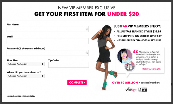
Figure 1. JustFab.com on-enter gated pop-up.
On enter
For me, pop-ups on enter like the one shown in figure 2, are far less annoying than on-enter gated. These pop-ups might display as soon as you land, after a period of time, or after you begin scrolling. These have a dismiss icon, so you can close the box without providing the information. If you choose this route, you’ll want to do some testing around the ideal time to let pass before displaying. I’ve found giving the reader 15 to 30 seconds to get a taste for the content produces better results. If you ask for their email address before they have determined the value of your site, you may scare them off.
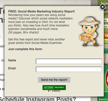
Figure 2. SocialMediaExaminer.com on-enter subscriber pop-up.
Header (or footer) notification
Header or footer notifications are far less intrusive, and thus could prove to be less effective. It’s easy to miss a message displayed at the very top of the page since the visitor’s eye is more typically drawn to the area that usually displays the menu bar. If you choose a header or footer notification like the one shown in figure 3 from infyways.com, try using a heat map to ensure your visitors are even looking at the notice before you decide the effectiveness of this approach.
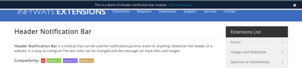
Figure 3. Infyways.com header notification pop-up.
On exit
The on-exit pop-up (figure 4), displays automatically as someone makes a move to leave a site. I like these pop-ups because it’s the what-have-I-got-to-lose approach?. Displaying a message after your visitor has already decided to leave your site is a great way to cause them pause and reconsider what they’ve just read. Was it really of no value? Did it have value only today? Did it have long-term value? If so, would they like to be notified of new, similar content?
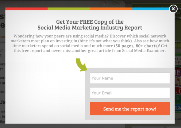
Figure 4. SocialMediaExaminer.com on-exit triggered pop-up.
Scroll-triggered pop-up
This pop-up (SpiderTrainers.com, figure 5) is triggered to display along the bottom edge (configurable) of the visitor’s browser window as they scroll down the page. It will display on any/all pages of the site, so it’s effective even if they’ve clicked a link directly through to a landing page.
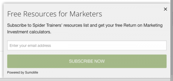
Figure 5. SpiderTrainers.com, scroll-triggered pop-up subscriber form.
If a pop-up isn’t for you or you are looking to augment the pop-up approach, there are plenty of other options for garnering your visitors’ email address.
In menu
As a marketer and website developer, I have never heard a compelling reason to not include a subscribe link in your menu — unless, of course, you simply don’t care about subscribes. On Spider Trainers’ site, shown in figure 6, I’ve given our subscribe link first-class citizen ranking, but other sites, such as XChange US, figure 7, have included it as a sub-menu.

Figure 6. SpiderTrainers.com in-menu subscribe link.

Figure 7. XChangeUS.com sub-menu subscribe link.
Dynamic menu
If a top-level menu isn’t drawing enough attention, try replacing your menu altogether for select pages, as shown in figure 8, Sploid.com.
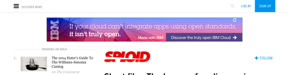
Figure 9. Sploid.com dynamic menu subscribe notice.
In footer
In another example from Spider Trainers’ website, figure 9 shows an in-footer subscribe form. We’ve chosen to include this on every page as well for those readers who have scrolled to the bottom of an article and now want to subscribe. Since our primary subscribe link for most pages is in the top menu, someone who is at the bottom of the article might miss our link.

Figure 9. SpiderTrainers.com footer subscribe form.
In sidebar
As I mentioned earlier, I’ve tried all of these different approaches and a visit to SpiderTrainers.com will show you that I continue to use several different approaches. I want to ensure it is an easy as possible to subscribe to our list and give the reader the opportunity to do so from any page, whether they are at the top of the page, the bottom of the page, and even on pages where they might not be thinking of subscribing. Sidebar subscribe forms are shorter (shown in figure 10), requesting only an email address, and enable the visitor to sign up and stay on the page they are reading.
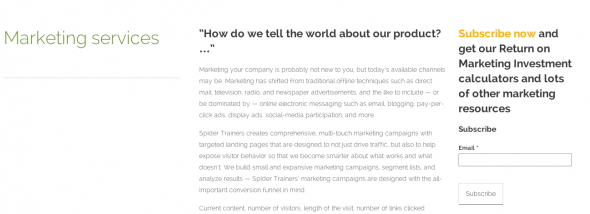
Figure 10. SpiderTrainers.com sidebar short subscriber form.
Gated resources
Gated resources are — in my mind — are less annoying than gated on-enter, but everyone might not agree (in fact, my client relations manager strongly disagrees). Despite Chuck’s objections, as shown in figure 11, rather than withholding the balance of the story or the entire site, I have created summary information about the resource in order to convince the visitor they should provide their email address in exchange for access to the resource. With the form submitted, rather than display the resource as a download in a confirmation screen, we send an email with links to all of our resources (figure 12), as well as subscribe them to our notification list. In this way, the new subscriber cannot get by with creating a fake email address.
We’ve chosen specifically to request only the email address, but with this method you could request more — you need to strike a balance between the required information and the value of the resource they will receive. In this case, we believe the content is valuable enough to require more information, but through testing, we found we had higher conversion rates when we requested only the email address and through continued engagement and progressive forms, we could acquire additional information about the subscriber as the relationship continued.
Figure 12. SpiderTrainers.com subscriber confirmation email with links to all premium resources.
Relevant in-article
Subscribe buttons, links, and forms can go anywhere on your site — I’ve already shown them displayed as a menu option, as a dynamic menu, in the footers, and in sidebars — but in-article positioning is one many marketers forget. In figure 13, Ashton Tweed has created a relevant in-article subscribe link. This particular link will enable them to subscribe to emails that continue the discussion about featured careers, the very page they are visiting on the site.

Figure 13. AshtonTweed.com relevant in-article subscriber link.
In article
In figure 14, I’ve included an example from ViperChill’s website. This is an in-article (in-blog) subscriber form with social sharing buttons. We ran this type of in-article form at SpiderTrainers.com for several months and collected only a small handful of subscribes, but don’t let that deter you. As I pointed out earlier, your business may have more success than my business with any particular type.
Figure 14. ViperChill.com in-article subscriber form with social sharing buttons.
A/B testing and analytics
There are probably as many approaches as there are businesses and websites, but this list is a good overview. Don’t stop at just installing the form or plug-in, without analytics and careful monitoring, you’re not getting smarter about what works and what doesn’t. If you’ve installed a subscriber pop-up plug-in and you’re not getting sign-ups, first make sure the product is working properly and then check your analytics. Are you actually getting traffic to the page where you’ve included your capturing system? Using a heatmap, are people viewing it? Lastly, these products are not mutually exclusive. Try lots of approaches all at once — that in itself can be the A/B test: which product is most effective on which pages?
Automation
Most of these products will capture your prospects into a database of some sort, but automating the passing of leads into your email system will make the entire process more valuable to you. By passing the data automatically, you can also create instantaneous auto-responders welcoming your new subscriber. While you’re sopping for a product, ensure you check to see if it supports your chosen email-automation platform, and if not, look to see how you can automate this process. We use Zapier (http://www.zapier.com) and have found we can directly support the client’s application about 90% of the time.
For most of us, we have a methodical approach to building a marketing campaign and I think this same approach can be used as a plan for growing your list:
1. Define a measurable goal
2. Choose tools you will use for measuring success/failure of the effort
3. Outline with metrics are important to showing success/failure
4. Define A/B testing points
5. Analyze results
If you’ve had success with a particular product, please share your experience in the comments below. I’m always eager to learn about new products that can make me a better marketer — as I’m sure this blog’s readers are as well.
- Post Categories
- Blog
©2018 C SHAFFSTALL & SON DBA SPIDER TRAINERS | BASED IN ARIZONA'S WHITE MOUNTAINS